

Design for low vision users is no longer optional in modern web development. Millions of people worldwide live with reduced visual acuity, contrast sensitivity loss, or restricted visual fields. Many are classified as legally blind, yet they still use websites daily for shopping, learning, banking, healthcare, and communication.
Designing for legally blind and low vision users does not mean building a separate website. It means creating digital experiences that remain readable, usable, and functional under magnification, high contrast modes, and assistive technologies. When websites are designed with low vision accessibility in mind, they become clearer, more usable, and more inclusive for everyone.
This guide explains how low vision affects digital experiences, what WCAG 2.2 requires, and how to apply practical design techniques that improve usability without compromising brand identity.
Understanding Low Vision in a Digital Context
Before diving into design techniques, it’s important to understand what low vision actually means in real-world usage.
What Is Low Vision?
Low vision refers to a visual impairment that cannot be fully corrected with glasses, contact lenses, medication, or surgery. A person may still have usable sight but struggle with:
- Blurred vision
- Reduced contrast sensitivity
- Light sensitivity
- Difficulty recognizing shapes or text
- Narrowed visual field
Legal blindness is typically defined as best-corrected visual acuity of 20/200 or worse in the better eye, or a visual field of 20 degrees or less. However, many legally blind individuals can still read large text or perceive high-contrast content.
How Low Vision Users Experience Websites
Low vision users often rely on:
- Browser zoom (up to 200% or more)
- Screen magnifiers
- High contrast display modes
- Dark mode interfaces
- Larger text settings
- Customized color schemes
When websites are poorly designed, these adjustments can cause layouts to break, text to overlap, or navigation to disappear. That is where intentional design makes a critical difference.
If you want a clearer understanding of how legal blindness is defined and how prescription strength connects to digital usability, read our detailed guide on what a legally blind prescription and accessibility impact. It explains the medical thresholds, vision measurements, and how these factors influence accessibility standards on modern websites.
Key Design Barriers for Low Vision Users
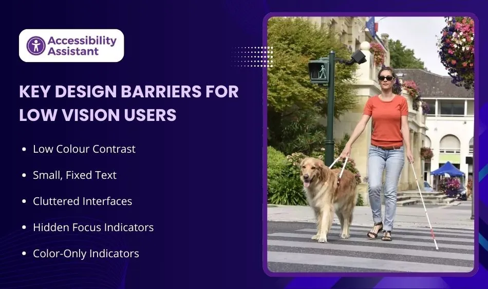
Understanding common barriers helps teams prevent accessibility failures early in the design process.
1. Low Colour Contrast
Low contrast between text and background is the most frequent accessibility failure. Light gray text on white backgrounds may look modern, but it becomes unreadable under magnification or reduced contrast sensitivity.
2. Small, Fixed Text
If text is locked in pixel sizes and does not scale properly, it becomes difficult to read. Users who zoom may experience clipped content or horizontal scrolling.
3. Cluttered Interfaces
Overcrowded layouts with little spacing create cognitive and visual overload. Low vision users may struggle to distinguish between sections.
4. Hidden Focus Indicators
Keyboard users depend on visible focus outlines. When designers remove or minimize them, navigation becomes confusing.
5. Color-Only Indicators
Using color alone to show errors or selections excludes users with contrast limitations or color perception differences.
WCAG 2.2 Requirements That Support Low Vision Accessibility
WCAG (Web Content Accessibility Guidelines) provides technical guidance that directly supports accessibility for people with low vision.
Contrast Requirements
- 4.5:1 ratio for normal text
- 3:1 ratio for large text
- 3:1 ratio for UI components and graphical elements
While 4.5:1 is the minimum, aiming for 7:1 significantly improves readability.
Text Resize
Users must be able to resize text up to 200% without loss of content or functionality.
Reflow
Content must reflow properly at 320px width without requiring horizontal scrolling. This ensures usability under magnification.
Focus Appearance (WCAG 2.2 Update)
Focus indicators must meet contrast and size requirements so users can clearly see where they are navigating.
Non-Text Contrast
Buttons, icons, borders, and graphical elements must meet minimum contrast thresholds to remain visible.
Core Design Principles to Design for Low Vision Users
Accessibility does not limit creativity. It guides better decision-making.
Use Accessible Colour Systems
Instead of selecting colors solely for branding, build a palette tested against contrast standards. Define primary, secondary, and neutral colors with contrast ratios in mind.
Consider:
- Dark text on light backgrounds
- Clear borders for buttons
- Distinct states for hover and focus
Scalable Typography
Use relative units such as rem or em instead of fixed pixel sizes.
Recommended practices:
- Base font size: 16px minimum
- Line height: 1.5x body text
- Paragraph spacing: adequate separation
- Avoid ultra-thin font weights
Readable typography improves usability for all users.
Improve Layout Clarity
Use whitespace strategically. Clear separation between sections improves scanning and reduces visual fatigue.
Keep:
- Consistent heading structure
- Balanced margins
- Clear section breaks
Strong Visual Hierarchy
Proper heading levels help both users and assistive technologies. Use H1 for the page title, followed by logical H2 and H3 structures.
Design Visible, Large Controls
Buttons and interactive elements should:
- Have sufficient padding
- Include visible borders
- Use strong contrast
- Provide clear hover and focus states
Small, low-contrast buttons are difficult for magnified viewing.
Low Vision Website Design Checklist
Below is a practical checklist to guide implementation.
| Design Area | Recommended Standard | Why It Matters |
| Body Text Size | 16px minimum | Improves baseline readability |
| Contrast Ratio | 4.5:1 minimum (aim 7:1) | Reduces strain and improves clarity |
| Text Resize | 200% without layout break | Supports magnification tools |
| Reflow | No horizontal scroll at 320px | Ensures Zoom usability |
| Focus Indicators | 3:1 contrast visible outline | Improves keyboard navigation |
| Line Spacing | 1.5x minimum | Enhances reading flow |
| Button Size | Minimum 44x44px touch area | Easier interaction |
| Non-Text Contrast | 3:1 for icons/borders | Maintains visual clarity |
How to Test Your Website for Low Vision Accessibility
Design intentions must be validated with testing.
Manual Zoom Testing
- Zoom to 200% in the browser
- Check if content overlaps
- Verify navigation remains accessible
- Ensure no horizontal scrolling
High Contrast Mode Testing
Enable system high contrast settings and evaluate visual clarity.
Contrast Checker Tools
Use professional tools to test color combinations. Verify text, buttons, and graphical elements meet required ratios.
Screen Magnification
Test using operating system magnifiers to simulate real usage conditions.
Keyboard Testing
Navigate using only the keyboard. Confirm focus outlines are visible and logical.
Testing should be part of every design review cycle.
Before finalizing your low vision design improvements, it’s important to test how your website performs under real accessibility conditions. Our guide on how to check your website for accessibility issues walks through practical testing steps, tools, and manual checks to help you identify barriers that may affect visually impaired users.
Common Mistakes Designers Make
Even experienced teams fall into patterns that reduce accessibility.
Overemphasis on Aesthetic Trends
Minimalism often sacrifices contrast. Thin fonts and subtle colors may appear modern, but harm readability.
Removing Focus Indicators
Designers sometimes hide focus outlines for visual reasons. This reduces navigational clarity.
Ignoring Dark Mode Contrast
Dark mode designs often fail contrast checks due to muted tones.
Relying Only on Automated Tools
Automation catches some issues, but manual inspection remains essential.
Not Retesting After Updates
New components or content changes can reintroduce accessibility issues.
Integrating Low Vision Accessibility Into Design Systems
Accessibility works best when integrated into a design system rather than added later.
Build Accessible Color Tokens
Define contrast-compliant color pairs at the system level.
Create Reusable Accessible Components
Buttons, forms, and cards should meet standards by default.
Document Accessibility Guidelines
Provide internal guidance for designers and developers.
Include Accessibility Reviews in Design Workflow
Accessibility checks should be part of design approvals.
When accessibility becomes systematic, consistency improves across all digital products.
Business and Legal Benefits of Designing for Low Vision Users
Accessibility improves more than compliance.
Reduced Legal Risk
Accessibility laws increasingly reference WCAG standards. Meeting these standards reduces exposure to complaints or litigation.
Improved User Experience
Clearer content benefits:
- Older users
- Mobile users
- Users in bright environments
- Users with temporary impairments
Better SEO Performance
Search engines favor structured, readable content. Accessible markup often aligns with search engine best practices.
Stronger Brand Reputation
Inclusive design builds trust and demonstrates social responsibility.
Real-World Example: Before and After Optimization
Before improvements:
- Light gray text on white
- Small 14px body font
- No visible focus outline
- Buttons with weak contrast
After applying low vision principles:
- Increased text size to 16px
- Adjusted contrast to 7:1
- Added visible focus states
- Improved spacing
Result:
- Higher engagement
- Lower bounce rate
- Improved readability across devices
Accessibility improvements often correlate with measurable usability gains.
Future Trends in Low Vision-Friendly Design
Technology continues to evolve.
Personalized Accessibility Settings
Users increasingly expect websites to remember preferred text size or contrast mode.
Adaptive Interfaces
AI may adjust contrast or layout dynamically based on usage patterns.
Improved Design Tools
Modern design platforms now integrate contrast checking directly into the workflow.
Greater Awareness
As digital accessibility becomes mainstream, expectations for inclusive design continue to rise.
Forward-thinking teams integrate accessibility early rather than reacting later.
Frequently Asked Questions About Low Vision For User
1. How to design for low vision?
To design for low vision users, focus on readability, clarity, and scalability. Key steps include:
- Use high colour contrast (minimum 4.5:1 for text, aim for 7:1 when possible)
- Allow text resizing up to 200% without layout breaking
- Use scalable font units (rem or em instead of fixed pixels)
- Provide visible focus indicators for keyboard navigation
- Avoid cluttered layouts and thin fonts
- Ensure content reflows properly without horizontal scrolling
Designing for low vision means building flexible layouts that remain usable under magnification and high contrast modes.
2. What is universal design for blind people?
Universal design is a design approach that makes products and environments usable by all people, without the need for adaptation. For blind and low vision users, universal design includes:
- Screen reader compatibility
- Logical heading structure
- Clear navigation patterns
- High contrast visual elements
- Keyboard-accessible interfaces
- Alternative text for images
The goal is not to create a separate version of a website but to design inclusively from the beginning so that all users can access content equally.
3. How do you ensure your designs are accessible to users with disabilities?
Accessibility is ensured through a combination of standards, testing, and inclusive design practices:
- Follow WCAG 2.2 guidelines
- Test colour contrast and text scaling
- Conduct keyboard-only navigation testing
- Use screen reader testing tools
- Validate layouts at 200% zoom
- Include accessibility reviews in design workflows
Regular testing and documentation are essential to maintain long-term accessibility compliance.
4. What are the 4 principles of accessible design?
The four core principles of accessible design come from WCAG and are known as POUR:
- Perceivable – Information must be presented in ways users can perceive (text alternatives, captions, strong contrast).
- Operable – Users must be able to navigate and interact with the interface (keyboard access, clear focus indicators).
- Understandable – Content and navigation should be clear and predictable.
- Robust – Content must work reliably across assistive technologies and devices.
These principles guide accessible website development worldwide.
5. What are the 7 design principles?
The 7 principles of universal design provide a broader framework for inclusive design:
- Equitable use
- Flexibility in use
- Simple and intuitive use
- Perceptible information
- Tolerance for error
- Low physical effort
- Size and space for approach and use
When applied to web design, these principles support usability for people with visual, motor, cognitive, and auditory impairments.
Conclusion: Designing for Low Vision Is Smart Design
Design for low vision users strengthens usability, compliance, and digital inclusivity. It ensures that content remains readable under magnification, maintains clarity under different contrast conditions, and supports diverse user needs.
By applying strong color contrast, scalable typography, visible focus indicators, and responsive layouts, teams can create websites that function reliably across visual conditions.
Accessible design is not a limitation. It is a quality standard.
When websites are built with clarity and usability in mind, everyone benefits.
Designing for low vision users is not just about meeting guidelines. It is about creating experiences that work in the real world.