Introduction
Colour contrast accessibility is one of the maximum unnoticed factors in website design. Yet it affects how users see, observe, and engage with your content. When your website lacks the proper evaluation, users with low vision or colour blindness may also struggle to observe textual content, select buttons, or entire documents.
According to the World Health Organisation, more than 2.2 billion people live with some form of visible impairment. For them, small layout flaws, like dwindled textual content or diminished buttons, can truly block get admission to.
Following WCAG 2.1 and WCAG 2.2 standards facilitates websites to become readable and compliant. It moreover improves engagement, brand attention, and search visibility. In this guide, you’ll study common colour contrast accessibility errors, how to check them, using free equipment, and quick fixes that make your website inclusive for all people.
Why Colour Contrast Accessibility Matters
Readability and Inclusion
Good contrast helps users see and understand information quickly. It ensures that people with visual limitations, such as colour-vision deficiency, low vision, or age-related sight loss, can read comfortably.
Poor contrast, like light grey text on a white background, causes strain and frustration. Many users simply leave a website if they can’t read or interact with its content. Maintaining colour contrast accessibility keeps your website functional for everyone and promotes true digital inclusion.
Legal and SEO Impact
Accessibility is both a legal requirement and a ranking factor. Under the Americans with Disabilities Act (ADA) and WCAG 2.2, websites must meet specific contrast ratios to avoid discrimination. Non-compliance may lead to lawsuits or reputational damage.
Search engines also value accessibility. High-contrast, readable text improves engagement and lowers bounce rates, key signals for better SEO rankings.
Business Trust and Conversions
A visually accessible website communicates professionalism and empathy. When users can read clearly, they stay longer and convert faster. Businesses that meet accessibility standards see higher trust, repeat visits, and a stronger word-of-mouth reputation.
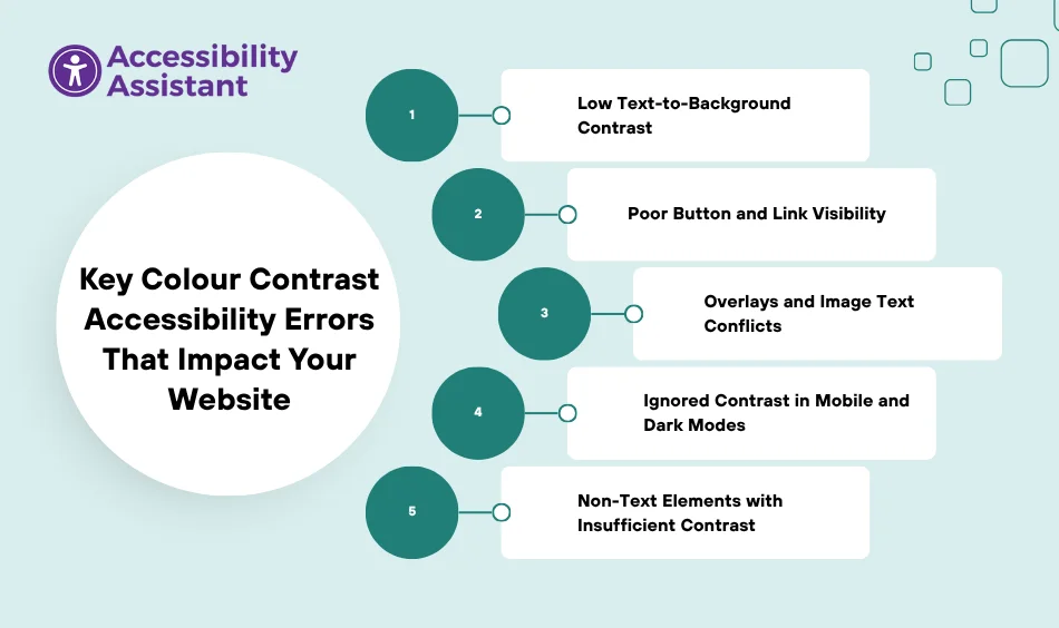
Key Colour Contrast Accessibility Errors That Impact Your Website

Even well-designed websites often miss simple accessibility principles. Below are the most common errors and how to fix them effectively.
1. Low Text-to-Background Contrast
The most frequent issue occurs when text and background colours are too similar. Users with limited vision find it nearly impossible to read pale text against a light background.
Quick Fix:
Ensure all body text meets at least a 4.5:1 contrast ratio, and large text (18 pt or 14 pt bold) meets 3:1. Adjust brightness or saturation until the ratio passes WCAG AA standards.
2. Poor Button and Link Visibility
Buttons, links, and navigation menus must be easy to identify. Faint outlines or low-contrast hover states confuse users and reduce clicks.
Quick Fix:
Use distinct colours for active, hover, and focus states. Maintain a 3:1 contrast ratio between the button text and background. Test your calls-to-action using a website color contrast checker.
3. Overlays and Image Text Conflicts
Text placed over background images or gradients often fails accessibility. Busy images can blur text readability even if the contrast ratio seems high.
Quick Fix:
Add a semi-transparent overlay or solid background behind the text. You can also use accessibility color test tools to evaluate readability in multiple lighting conditions.
4. Ignored Contrast in Mobile and Dark Modes
Dark mode is popular, but it brings new accessibility challenges. Some websites pass contrast checks in light mode but fail when switched to dark backgrounds.
Quick Fix:
Test both light and dark versions of your design. Use tools that simulate contrast under various brightness levels and devices. Maintain the same accessibility ratio across all themes.
5. Non-Text Elements with Insufficient Contrast
Icons, graphs, and charts often rely on colours alone to display meaning. Users with colour blindness may miss essential data or misinterpret visuals.
Quick Fix:
Use patterns, labels, or outlines to reinforce meaning. Ensure icons and UI components maintain a 3:1 contrast ratio against adjacent backgrounds.
Quick Reference Table: Fixing Common Colour Contrast Accessibility Errors
| Error / Issue | Tool to Detect | Recommended Fix |
| Colour Contrast & Readability (All-in-One Solution) | Accessibility Assistant | Instantly test and adjust colour contrast, font size, and brightness using built-in accessibility controls. Works across Shopify, WordPress, and Wix with no coding required. |
| Low Text Contrast | WebAIM Contrast Checker | Adjust text and background colours to meet a 4.5:1 ratio for normal text or 3:1 for large text. |
| Weak Button & Link Contrast | WAVE Evaluation Tool | Improve button backgrounds, hover/focus states, and outline visibility for clear user interaction. |
| Text Over Background Images | Coolors Contrast Checker | Add a solid overlay or background box behind the text to preserve readability. |
| Icons, Charts, or Graphs Lacking Contrast | Toptal Colour Filter Tool | Add borders, textures, or shape variations to differentiate data points clearly. |
| Dark Mode or Theme Conflicts | Manual Test + Lighthouse | Check both light and dark themes to maintain accessible contrast ratios in every mode. |
How to Test and Fix Colour Contrast Issues
Testing colour contrast accessibility doesn’t require costly software. Here are the most reliable free tools to help you identify and correct errors.
1. Accessibility Assistant (for Shopify, WordPress, and Wix)
Accessibility Assistant offers a built-in colour contrast checker along with features for low vision, dyslexia, and seizure-safe browsing. The widget lets users adjust contrast, font size, and spacing instantly—no coding needed.
Key Features:
- High-contrast, dark, and light viewing modes
- Keyboard navigation and reading support
- Multilingual compatibility with over 100 languages
- Fully customizable layout and icons
Key Highlights:
- No-code setup
- Customizable accessibility profiles (Low Vision, Dyslexia, Seizure Safe)
- Adjustable contrast, text size, and reading tools
- Multilingual interface supporting 100+ languages
- Affordable plans with free audits
How it helps:
You can test and adjust your site’s contrast in real time, keeping your brand compliant with WCAG 2.2 and ADA standards.
Accessibility Assistant allows users to personalise their viewing experience while you work on long-term improvements.
👉 Run a free accessibility scan today and check your site’s colour contrast score instantly.
2. WAVE Web Accessibility Evaluation Tool
WAVE highlights low-contrast text directly on your webpage. Once installed, it displays contrast errors under its dedicated “Contrast” tab.
Steps:
- Install WAVE for Chrome or Firefox.
- Open your website and click the WAVE icon.
- Review failed elements and adjust your colour palette accordingly.
Best for developers who need quick on-page audits.
3. WebAIM Colour Contrast Checker
WebAIM’s online checker allows you to enter HEX or RGB values to evaluate contrast ratios. It shows pass/fail indicators for WCAG AA and AAA standards.
Steps:
- Visit contrastchecker.com.
- Enter your text and background colours.
- Adjust until you meet 4.5:1 (normal text) or 3:1 (large text).
Best for validating brand colour pairs during design stages.
4. Contrast Checker by Coolors
Coolors lets designers upload entire colour palettes and instantly see which pairs fail accessibility. It also suggests replacements that preserve your brand identity while meeting accessibility standards.
Best for creative teams balancing design and readability.
5. Toptal Colour Filter Tool
Toptal’s simulator helps you experience how your website looks to users with different types of colour blindness, Protanopia, Deuteranopia, and Tritanopia.
Best for: Understanding accessibility beyond numbers and ratios by viewing your design from real-world perspectives.
6. Accessible Colours Website Contrast Checker
This web-based tool scans entire pages, checking headings, buttons, and text automatically. It then generates a visual report showing elements that fail accessibility.
Best for: Complete accessibility audits across large websites.
How to Fix Poor Colour Contrast
Adjust Colours Intelligently
If your design fails accessibility checks, tweak colour brightness and tone. Darken text or lighten backgrounds until readability meets the 4.5:1 standard. Avoid using colour alone to show meaning; add icons or text labels instead.
Choose the Right Combinations
Use web accessible colours that are both appealing and readable. Below are examples that pass WCAG AA standards.
| Background | Text | Ratio | Status |
| White #FFFFFF | Black #000000 | 21:1 | ✅ Pass |
| Light Beige #F9F6EE | Dark Grey #333333 | 14:1 | ✅ Pass |
| Light Grey #E6E6E6 | Navy #002B5B | 11:1 | ✅ Pass |
These combinations deliver clarity while preserving modern visual design.
Test Before Publishing
Run a full accessibility colour test before launching new pages. Focus on high-traffic areas such as home, product, and checkout pages.
Check:
- CTA buttons and links
- Form fields and error messages
- Headers and paragraph text
Add this review to your quality-assurance workflow.
Best Practices for Web Accessible Colours
- Maintain colour consistency across devices and viewports.
- Test hover and focus states for all interactive elements.
- Avoid relying on colour alone—combine text, icons, or textures.
- Keep an internal accessibility checklist for designers and developers.
- Audit regularly after updates or redesigns.
For detailed ratio rules and design recommendations, refer to 👉 Complete WCAG 2 Colour Contrast Accessibility Guidelines.
Real-World Benefits of Colour Contrast Accessibility
Better User Experience
Readable text and balanced colours keep visitors engaged. According to a 2024 WebAIM report, 83% of accessibility issues relate to poor text visibility. Improving contrast boosts satisfaction and encourages repeat visits.
Higher Conversion Rates
Clearer buttons and links increase interaction. Many e-commerce sites see up to 20% more conversions after improving contrast accessibility.
Legal and Ethical Confidence
Thousands of ADA-related lawsuits are filed every year. Meeting WCAG 2.2 contrast ratios protects your business legally and shows a commitment to inclusivity.
SEO and Visibility Boost
Accessible websites perform better in search because users stay longer and engage more. Google’s algorithms value user experience signals such as readability and dwell time.
Brand Trust and Reputation
Brands that care about accessibility are perceived as responsible and modern. Accessibility communicates that every user matters—an image that strengthens loyalty and public trust.
FAQs About Colour Contrast Accessibility
- What is colour contrast accessibility?
It’s the practice of ensuring enough visual difference between text and background colours so everyone can read easily. - What are the WCAG 2.2 contrast ratios?
Normal text = 4.5:1, large text = 3:1, UI elements = 3:1. - What are the best colours for accessibility?
High-contrast pairs like black on white, navy on beige, or dark grey on light grey. - Which tools test colour contrast accessibility?
Use Accessibility Assistant, WAVE, WebAIM, or Coolors to run checks. - Do I need coding skills to fix contrast issues?
No. Most tools and widgets are user-friendly and require no technical knowledge.
Conclusion
Colour contrast accessibility is one of the simplest yet most powerful steps to make your website inclusive and compliant. Fixing it improves readability, boosts SEO, and protects your brand from legal risks.
By following WCAG 2.2 standards and using free tools like Accessibility Assistant, WAVE, and WebAIM, you can identify and fix issues before they affect users.
Accessibility isn’t just about compliance; it’s about connection. Start testing your colours today and build a digital experience that everyone can enjoy.


