Colour contrast accessibility isn’t just about fashion; it’s approximately inclusion. When web factors lack sufficient contrast, human beings with low imaginative and prescient or color blindness can’t definitely distinguish the content. That influences usability and typical accessibility compliance.
With the WCAG 2.2 updates, keeping the right web color contrast is critical for creating readable and compliant designs. The new regulations help make sure text, icons, and visuals are legible throughout all gadgets and subject matters. Applying colour contrast accessibility concepts early prevents design transformation and improves every user’s experience.
This article explains the way to practice WCAG 2.2 color assessment accessibility in real tasks using layout tokens, CSS variables, and automatic checking out gear. You’ll additionally learn how to pick the exceptional colorings for accessibility, take a look at them the use of a colour comparison checker accessibility tool, and keep your palette compliant as your layout evolves.
Understanding WCAG 2.2 Colour Contrast Basics
Minimum Contrast Ratios You Need to Follow
WCAG 2.2 defines minimum contrast ratios between text and its background to guarantee readability for all users.
- Normal text: At least 4.5:1 contrast ratio (AA level)
- Large text: 3:1 contrast ratio (AA level)
- AAA compliance: 7:1 for normal text, 4.5:1 for large text
- UI components & icons: Minimum 3:1 contrast ratio
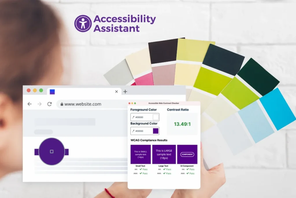
Meeting these ratios means your web accessible colours remain visible in different brightness levels and device displays. A quick check with a color contrast checker accessibility tool ensures your text, links, and buttons meet these numbers.
Common Misconceptions About Colour Contrast
Many assume that if something looks fine on their monitor, it’s accessible, but that’s rarely true. Users experience colour differently based on age, lighting, and vision ability. A pastel blue heading on a white background might look clean to one user but invisible to another.
Another misconception is believing brand colours can’t be adjusted. You can tweak brightness or hue slightly while keeping visual identity intact. The goal is to maintain readability without compromising branding.
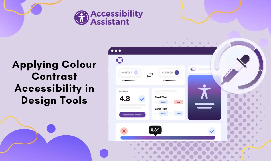
Applying Colour Contrast Accessibility in Design Tools

Setting Up Accessible Palettes in Figma or Adobe XD
Design tools like Figma and Adobe XD make it easy to test colour contrast accessibility with plugins. Start by building an accessible colour palette using tools like Stark, Able, or Contrast Checker. These plugins instantly measure contrast between your chosen colours.
When defining the best color contrast for website readability:
- Test your primary and secondary brand colours.
- Adjust saturation or brightness to reach at least a 4.5:1 ratio.
- Save contrast-approved shades as your base palette.
Grouping colours by function (primary buttons, links, background, alerts) makes ongoing accessibility testing color easier. Use labels such as “text-primary,” “background-light,” and “link-hover” for consistent naming.
Creating Reusable Design Tokens
Once your palette is ready, convert colours into design tokens. Design tokens help designers and developers stay consistent when implementing web accessible colours across large projects.
Example:
primary-100: #1E1E1E
secondary-100: #F8F8F8
accent-100: #0052CC
error-100: #D93025
These tokens connect directly to development environments. When combined with automated accessibility testing color checks, tokens ensure future updates don’t break contrast compliance.
Implementing WCAG 2.2 Colour Contrast in Frontend Code
Using CSS Variables for Consistent Colours
Bringing accessibility into your frontend starts with a clear structure. CSS variables help maintain consistent web color contrast across pages.
Example:
:root {
–color-text: #111111;
–color-background: #ffffff;
–color-link: #0A84FF;
–color-link-hover: #0066CC;
}
This lets you change one variable to update colour site-wide, essential for managing dark and light themes. Make sure every component (text, icon, alert) meets WCAG 2.2 colour contrast thresholds.
Testing Colour Contrast During Development
Automated testing ensures that accessibility isn’t left to chance. Integrate tools like:
- Axe DevTools or Wave for live browser checks.
- Lighthouse for full accessibility audits.
- Pa11y CI or jest-axe for continuous integration tests.
A color contrast checker accessibility plugin quickly validates each text-background pair. Include these in your build pipeline so no developer can merge low-contrast elements accidentally.
Team Workflows That Maintain Colour Contrast Accessibility Over Time

Smooth coordination between design and QA keeps your colour contrast accessibility stable as your product grows. During handoff, share every detail that helps teams make accurate decisions:
- Approved web accessible colours with their HEX values
- Minimum contrast ratios required for each component (AA or AAA)
- Screenshots of compliant and non-compliant contrast examples
- Notes for hover states, focus states, and disabled states
- A list of components that need extra attention, such as badges, icons, and overlays
In addition, many teams now attach Figma accessibility reports, plugin exports, or design system links. These resources, in turn, help QA validate every state, not just the static layout. As a result, with standardized handoff material, QA can catch colour issues earlier, thereby reducing rework and keeping accessibility consistent across releases.
Accessibility Testing in Real Scenarios
Accessibility testing goes beyond automated tools. Real users view your interface in different lighting conditions, device brightness levels, and screen types. Testing in realistic conditions highlights issues that automated checkers sometimes miss.
For accurate results:
- Test interfaces in light and dark themes independently
- Use colour-blind simulators that cover red-green, blue-yellow, and monochrome filters
- Compare the best colors for accessibility across mobile, tablet, and desktop
- Check the content outdoors where glare affects the web color contrast
- Evaluate text and icons with system-wide settings like high contrast mode
- Review UI under OLED displays, since deeper blacks can shift visibility
Modern tools now offer AI-driven accessibility testing color simulations, helping teams predict how users with different visual conditions perceive contrast. This real-world validation complements your automated scans and helps maintain consistent readability across environments.
Common Issues That Affect Colour Contrast Accessibility Compliance
Dynamic Elements and Hover States
Interactive elements often lose contrast when hovered over or focused on. Always check hover states and animations with a color contrast checker accessibility tool.
Gradients and Transparency
Gradients may look modern, but can reduce readability if not balanced. Keep your lightest gradient point above the required ratio. Avoid overlaying semi-transparent layers over text.
Icon Contrast
Icons and visual indicators must also maintain web color contrast. Ensure status icons like warnings or errors meet at least a 3:1 ratio.
Brand Colour Limitations
Don’t sacrifice accessibility for brand colour purity. Slight hue or saturation adjustments preserve design identity while achieving the best color contrast for website readability.
For a deeper look at real-world mistakes, you can check our detailed guide on common colour contrast accessibility errors. It explains the most frequent contrast issues designers overlook and how to fix them quickly.
Embedding Contrast Accessibility in Scalable Design Systems
Strong design systems include accessibility as a built-in rule, not an afterthought.
Add Accessibility Tokens
Maintain separate tokens for compliant combinations:
accessible-text-dark: #FFFFFF
accessible-text-light: #000000
Document Ratio Standards
Document every token’s ratio and use a built-in web color contrast chart. This ensures future designers follow your standards automatically.
Automate Testing
Automated scripts can verify colour contrast ratios whenever tokens change. This helps sustain colour contrast accessibility over long-term product updates.
Real-World Example: Applying Contrast Accessibility in a Web App
Imagine a team updating their SaaS dashboard UI.
Step 1: Run an Audit
Use Wave or Axe to identify low-contrast areas like grey labels or light buttons.
Step 2: Adjust Tokens
Replace low-contrast greys (#999999) with darker shades (#444444). Test again using a color contrast checker accessibility extension.
Step 3: Validate Ratios
Confirm text-to-background ratios meet WCAG 2.2 colour contrast guidelines.
Step 4: Update Documentation
Add results to your design system under “web accessible colours.”
Step 5: Test Across Themes
Run accessibility testing color for both light and dark modes to maintain compliance.
The result: improved readability, fewer user complaints, and verified compliance across all devices.
Accessibility for Modern Themes and Dark Mode
Dark themes bring comfort but can cause readability issues if not tested properly.
Follow these best practices:
- Avoid pure black and pure white combinations; use soft contrasts for comfort.
- Keep accent tones visible across both modes.
- Use dual variable sets for light and dark tokens:
–text-color-light: #111111;
–text-color-dark: #F1F1F1;
Tools like Contrast Checker or Stark help verify the best colors for accessibility across modes.
Recommended Tools for Colour Contrast Testing
| Stage | Tool | Purpose |
| Design | Stark, Contrast | Build and test web accessible colours |
| Development | Axe DevTools, Lighthouse | Detect low-contrast areas |
| QA | Wave, Accessibility Insights | Validate across devices |
| Automation | Pa11y CI, jest-axe | Run accessibility testing color during deployment |
Each ensures you maintain proper web color contrast across every phase of design and development.
Keep your site compliant with Accessibility Assistant, your all-in-one solution for colour contrast accessibility. The widget checks web color contrast, adjusts brightness, and suggests the best color contrast for website readability instantly. It supports WCAG, ADA, and EAA standards; as a result, every visitor enjoys a clear and accessible experience without the need for any code edits.
FAQs
Q1. What is the ideal contrast ratio for accessible websites?
WCAG 2.2 requires a 4.5:1 ratio for normal text and 3:1 for large text or icons.
Q2. Which tool is best for testing color contrast accessibility?
Tools like Stark, Wave, and Axe DevTools are excellent for accessibility testing color in real time.
Q3. How can I choose the best colors for accessibility?
Pick colours with enough contrast using a color contrast checker accessibility tool, ensuring text is readable against all backgrounds.
Q4. Why does dark mode affect web color contrast?
Because colours behave differently on dark backgrounds, you must re-test ratios separately for each mode.
Q5. How do design tokens help maintain accessibility?
Tokens store web accessible colours consistently across design and code, reducing human error and preserving compliance.
Conclusion
Applying WCAG 2.2 colour contrast accessibility in real projects improves readability, compliance, and brand trust. By creating accessible colour palettes, integrating tokens, and using color contrast checker accessibility tools, teams can maintain consistent visibility across all interfaces.
Accessibility isn’t about restrictions; it’s about usability. Good web color contrast ensures your design reaches everyone equally, regardless of their visual ability.
Adopt the best colors for accessibility, test continuously, and keep documentation updated. Accessibility then becomes part of your design culture, not just a compliance checkbox.

