
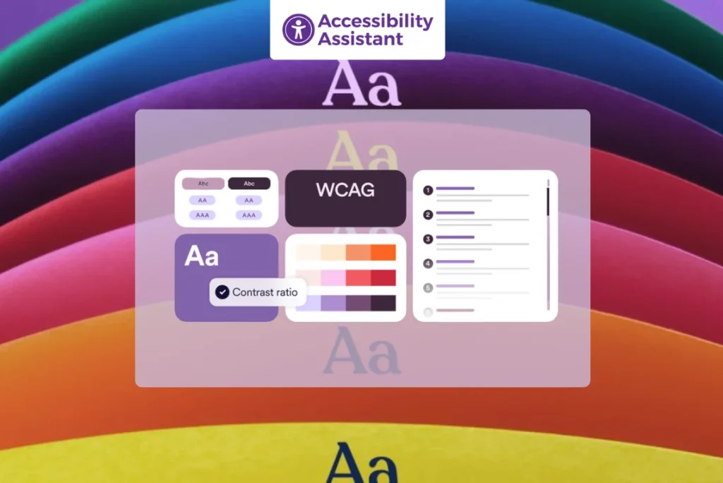
Introduction
Colour contrast performs an essential function in digital accessibility. For people with low vision, color blindness, or cognitive impairments, proper assessment guarantees that text and interface factors are readable and usable. Following colour assessment accessibility pointers allows designers, developers, and companies to meet compliance requirements like WCAG color contrast (Web Content Accessibility Guidelines).
According to WCAG 2.0, colour comparison, and later updates in 2.1 and 2.2, color evaluation is one of the most essential accessibility ideas. These standards assist in creating a web where every person — no matter their visual capacity- can access content comfortably.
In this detailed guide, we’ll explore color contrast guidelines for accessibility, checking out tools, compliance levels, and practical implementation recommendations.
What Is Colour Contrast in Accessibility
Colour contrast refers to the distinction in luminance or brightness between colors, normally the text color (foreground) and its background. Higher contrast makes content material simpler to examine and recognize, especially for humans with visual or cognitive impairments.
In accessibility standards, inclusive of WCAG 2.0 coloration comparison and later updates in WCAG 2.2, this distinction is expressed as an evaluation ratio, starting from 1:1 (no contrast) to 21:1 (maximum contrast).
Examples of Common Contrast Ratios
- Black text on a white background: 21:1 (excellent contrast, passes all WCAG levels)
- Dark gray (#333333) on white: ~12:1 (passes AA and AAA)
- Light gray (#999999) on white: ~1.5:1 (fails accessibility standards)
- Yellow text on white: ~1.1:1 (fails all levels)
Meeting web accessibility guidelines, color contrast ensures your content remains readable by users with different visual abilities, devices, and lighting environments.
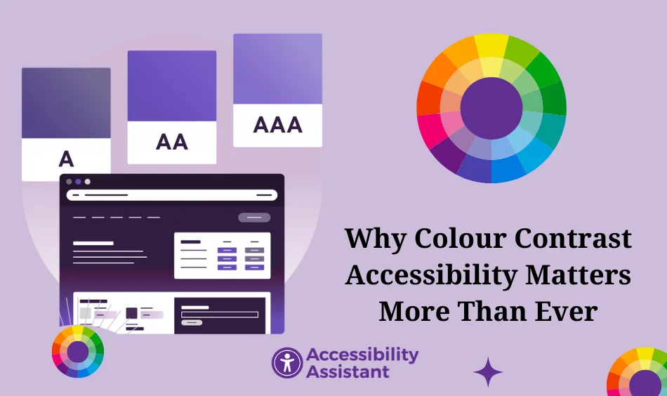
Why Colour Contrast Accessibility Matters More Than Ever
Accessibility is not just a design preference; it’s a legal, ethical, and business requirement. Poor color contrast can make reading difficult or even impossible for:
- Individuals with color blindness or cataracts
- People viewing content in bright sunlight or on low-quality screens
- Users with low vision or cognitive processing challenges
Accessible contrast improves usability and conversion rates, while also enhancing search engine performance (SEO) since Google now considers readability and accessibility signals in page quality metrics.
Additional Benefits of Strong Colour Contrast
- Improves overall readability and retention time
- Boosts mobile accessibility, especially in dark mode or high-contrast settings
- Supports compliance with WCAG color contrast and international accessibility laws (like ADA, EN 301 549, and AODA)
- Builds brand trust by showing inclusion and responsibility
According to colour accessibility guidelines, accessible contrast benefits everyone, not just people with disabilities. Even users without impairments find high-contrast content easier to read and more visually appealing, particularly in modern UI trends such as dark mode, minimalism, and bold typography.
Understanding Contrast Ratios in Accessibility (WCAG 2.2 Update)
The Web Content Accessibility Guidelines (WCAG) set the global standard for digital accessibility. Within WCAG, the color contrast rules fall under the Perceivable principle, ensuring that every user, regardless of visual ability, can clearly see and distinguish text, UI elements, and images.
Contrast requirements were first introduced in WCAG 2.0 (2008) and refined through WCAG 2.1 (2018) and WCAG 2.2 (2023). These guidelines define the minimum contrast ratio required between foreground (text or icon) and background colors.
WCAG 2 Color Contrast Success Criteria
| WCAG Level | Criteria | Minimum Contrast Ratio | Applicable Elements |
| AA | 1.4.3 Contrast (Minimum) | 4.5: 1 | Normal text |
| AA | 1.4.3 Contrast (Minimum) | 3: 1 | Large text (≥ 18 pt regular or 14 pt bold) |
| AAA | 1.4.6 Contrast (Enhanced) | 7: 1 | Normal text |
| AAA | 1.4.6 Contrast (Enhanced) | 4.5: 1 | Large text |
| AA | 1.4.11 Non-Text Contrast | 3: 1 | UI components, icons, graphical objects, and visible focus indicators |
These color contrast guidelines for accessibility ensure sufficient visual distinction between foreground and background, enhancing legibility and user comfort — particularly for users with low vision or color vision deficiencies.
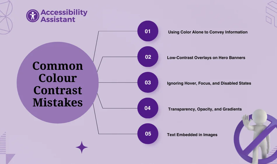
Common Colour Contrast Mistakes (and How to Avoid Them)
Even experienced designers can unintentionally break web accessibility guidelines for color contrast, especially with modern design trends like minimalism, gradients, and dark mode interfaces. Poor contrast doesn’t just make content harder to read; it can exclude users with visual impairments and lead to compliance failures under WCAG 2.2 color contrast requirements.
Below are some of the most common contrast mistakes and how to fix them:
1. Using Color Alone to Convey Information
A frequent accessibility issue is relying solely on color to communicate meaning, for example, using red for “error” or green for “success” without any supporting visual cue.
Why it’s a problem:
Users with color blindness or low vision may not distinguish between certain hues, such as red and green.
Fix:
- Combine colors with text labels, icons, or shapes.
- Use aria-labels or descriptive tooltips for clarity.
- Example: Pair a green checkmark with “Success” or ❌ “Error.”
2. Low-Contrast Overlays on Hero Banners
Hero sections and promotional images are common accessibility offenders. Placing text directly over complex or bright backgrounds often creates insufficient contrast.
Why it’s a problem:
Text over images or gradients can become unreadable on certain screens or under bright light.
Fix:
- Add a semi-transparent overlay (dark or light tint) behind text.
- Use a solid background container for headlines and CTAs.
- Test color combinations using a contrast checker to meet WCAG AA (4.5:1) ratios.
Pro Tip: AI-driven design tools like Figma’s Contrast Plugin and Stark can now auto-detect low-contrast regions and suggest compliant adjustments instantly.
3. Ignoring Hover, Focus, and Disabled States
Many teams design for default states but overlook how interactive elements behave when hovered, focused, or disabled.
Why it’s a problem:
Low contrast in hover or focus states makes navigation difficult for keyboard and low-vision users.
Fix:
- Ensure all interactive states (hover, active, focus) maintain at least a 3:1 contrast ratio.
- Add visible focus indicators with outlines or highlights that meet WCAG 2.2’s Focus Appearance criterion.
- For disabled elements, don’t rely on faded colors alone, consider using icons or labels like “Unavailable.”
Example (CSS):
- button:focus {
- outline: 2px solid #000; /* Visible focus indicator */
- }
4. Transparency, Opacity, and Gradients
Designers often use transparent layers or gradient overlays for aesthetic appeal—but these can unintentionally lower contrast levels.
Why it’s a problem:
Reduced opacity affects how colors blend, which can drop your effective contrast below the WCAG threshold.
Fix:
- Test contrast after applying opacity or gradient effects.
- Keep opacity above 90% for text backgrounds.
- Use solid backgrounds for important text like CTAs and headings.
- Always verify the final rendered color (not just the design layer) using a color contrast analyzer.
Pro Tip: Modern browsers and dev tools now calculate computed color contrast in the inspector, making real-time validation much easier.
5. Text Embedded in Images
Including text inside images is still common in marketing banners, ads, and infographics—but it’s a major accessibility red flag.
Why it’s a problem:
Screen readers can’t interpret text that’s part of an image, and automated accessibility tools can’t analyze its contrast accurately.
Fix:
- Use HTML text overlaying the image, not embedded text.
- If unavoidable, provide alt text that includes the same message.
- Use sufficient contrast (4.5:1) between text and the image background.
- Prefer SVGs for logos or icons that scale and maintain clarity.
Best Tools to Check Colour Contrast Accessibility (2025 Edition)
You don’t have to rely on guesswork to ensure your website meets the WCAG 2.0 color contrast and WCAG 2.2 accessibility standards. Modern accessibility tools simplify testing, detect contrast issues in real time, and even suggest compliant color adjustments.
Here are the top five tools you can use to measure and improve colour contrast accessibility:
1. Accessibility Assistant
Accessibility Assistant is an all-in-one accessibility auditing tool designed for designers, developers, and agencies aiming to meet WCAG compliance faster. It automatically detects color contrast issues, missing alt text, focus traps, and ARIA errors across your website.
Key Features:
- Real-time contrast ratio detection for text, buttons, and icons.
- AI-powered fix suggestions for non-compliant colors.
- Supports both WCAG 2.0 and 2.2 color contrast standards.
- Simple visual reports for teams to identify and fix issues quickly.
- No coding knowledge required — perfect for Shopify, WordPress, and custom sites.
Bonus: It also checks for keyboard accessibility, ARIA roles, and screen reader compatibility, giving you a full-picture audit of accessibility compliance in an easy way.
2. WebAIM Contrast Checker
A long-time favorite among accessibility professionals, WebAIM Contrast Checker provides an instant ratio between foreground and background colors.
3. Stark (Figma, Sketch, Adobe XD Plugin)
Stark is a must-have plugin for designers who work directly in tools like Figma or Adobe XD. It integrates accessibility testing into the design process before development begins.
4. axe DevTools (Deque Systems)
A browser extension trusted by accessibility experts, axe DevTools performs automated accessibility scans, including color contrast analysis, right inside Chrome or Firefox DevTools.
5. Lighthouse (Built Into Chrome)
Lighthouse, developed by Google, offers built-in accessibility audits that include color contrast testing. It’s ideal for quick checks while debugging websites.
Real-World Example: Before and After Colour Contrast Fix
Let’s look at a practical example of how small color changes can make a huge difference in accessibility and readability.
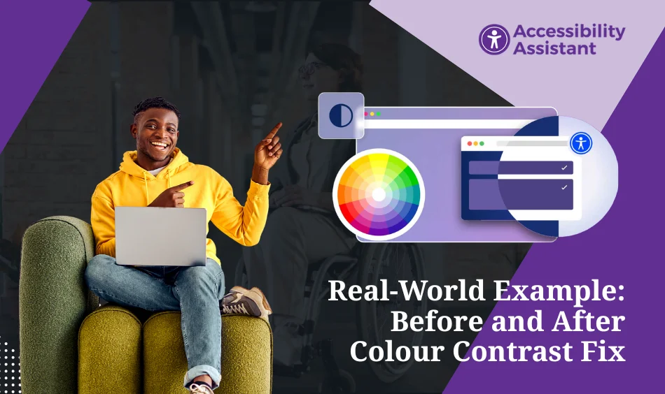
Before:
A landing page uses light gray text (#B3B3B3) on a white background (#FFFFFF). It looks modern and minimal, but the contrast ratio is only 2.1:1, which fails WCAG 2.0 AA standards.
This low contrast might look sleek on high-quality displays, but for users with low vision, older monitors, or bright outdoor conditions, the text becomes difficult—or even impossible—to read.
After:
By simply darkening the text to #333333, the contrast ratio jumps to 12.6:1, passing both WCAG AA and AAA levels.
This small change dramatically improves legibility for:
- Users with color vision deficiencies
- People using devices in high-glare environments
- Those reading on low-brightness mobile screens
Additionally, this higher contrast improves SEO metrics by reducing bounce rates and improving time-on-page, since users can now comfortably read the content.
FAQs About the Colour Contrast Accessibility Guidelines
Q1. What is a good color contrast ratio for accessibility?
The minimum is 4.5:1 for normal text and 3:1 for large text, according to WCAG color contrast guidelines.
Q2. What is the color contrast for WCAG AAA?
The WCAG AAA color contrast standard represents the highest level of accessibility compliance. It requires a minimum contrast ratio of 7:1 for normal text and 4.5:1 for large text (18 pt or 14 pt bold). Achieving AAA ensures optimal readability for users with visual impairments or when viewing on low-contrast displays.
Q3. What is the minimum color contrast ratio stated in the WCAG/AA guidelines?
According to WCAG 2.1 and 2.2, the minimum color contrast ratio for Level AA compliance is:
- 4.5:1 for normal text (body copy)
- 3:1 for large text, bold text, or UI elements like buttons and labels
These ratios ensure sufficient distinction between foreground and background colors for most users.
Q4. What is the WCAG color contrast algorithm?
The WCAG color contrast algorithm calculates the relative luminance between two colors using this formula:
(L1+0.05)÷(L2+0.05)(L1 + 0.05) ÷ (L2 + 0.05)(L1+0.05)÷(L2+0.05)
Where:
- L1 = luminance of the lighter color
- L2 = luminance of the darker color
The result is a ratio between 1:1 (no contrast) and 21:1 (maximum contrast).
This formula ensures consistency across all digital designs, allowing accurate testing with tools like Accessibility Assistant, WebAIM, or Stark.
Q5. What is the difference between AA and AAA color contrast?
The main difference lies in the required contrast ratio and the level of accessibility compliance:
| WCAG Level | Normal Text | Large Text | Purpose |
| AA | 4.5:1 | 3:1 | Minimum compliance for accessible design |
| AAA | 7:1 | 4.5:1 | Enhanced readability for users with low vision |
While AA is the standard most organizations aim to meet, AAA provides an extra level of inclusivity, ideal for healthcare, government, and education websites where clarity is critical.
Conclusion
Adhering to colour contrast accessibility guidelines is one of the simplest and most impactful steps toward inclusive design. Whether you’re a designer, developer, or business owner, following WCAG 2.0 color contrast standards ensures your digital content is readable, compliant, and user-friendly.
Good contrast isn’t just a compliance checkbox; it’s a sign of respect for your users.
By embracing color contrast guidelines for accessibility, you’re creating a web that truly welcomes everyone.