

The internet should work for everyone, but for many people with blindness, low vision, or color-vision deficiency, it still doesn’t. Navigation dead-ends, unreadable text, and unlabeled buttons are everyday hurdles that block basic tasks like reading content, comparing products, or checking out. If you care about web accessibility for visually impaired users, this guide breaks down the mistakes that cause the most friction and shows practical ways to fix them, without guesswork.
You’ll find:
- The core principles behind web accessibility for visually impaired users
- The most common errors (with fixes you can ship today)
- A lightweight testing workflow that pairs automated checks with real user scenarios
- A quick table that maps problems → tools → fixes
- How an on-site accessibility widget (like Accessibility Assistant for Shopify, WordPress, and Wix) can help with everyday barriers
- Short FAQs you can hand to your dev or content team
Understanding Web Accessibility for Visually Impaired Users
Web accessibility for visually impaired users means designing and building websites that people with blindness, low vision, or color blindness can use independently. That includes:
- Blindness: Users rely on screen readers (JAWS, NVDA, VoiceOver) and sometimes refreshable Braille displays.
- Low vision: Users often zoom content, prefer high contrast, and benefit from readable fonts, increased spacing, and reduced motion.
- Color blindness: Users need information that doesn’t rely on color alone and meets contrast thresholds so text and controls are legible.
Standards like WCAG 2.1 and 2.2 (AA level) translate these needs into testable criteria: text alternatives for images, keyboard access, contrast ratios, logical structure, and more. While lawsuits and regulations create urgency, the bigger reason to invest in web accessibility for visually impaired users is simple: it’s the right way to build the web, and it improves UX for everyone.
Common Accessibility Errors That Affect Visually Impaired Users (and How to Fix Them)
1) Missing or Inaccurate Alt Text
The problem: Images communicate vital context, product details, callouts, and instructions. Without accurate alternative text, screen reader users get silence or unhelpful file names.
What to do:
- Write concise, meaningful alt text that reflects the purpose of the image in context.
- Use alt=”” for purely decorative images.
- Don’t stuff keywords; describe what a sighted user needs to know.
- For complex infographics, include a nearby text summary.
Quick example:
“Red cotton t-shirt with white front logo” says far more than “IMG_2033”.
2) Poor Color Contrast
The problem: Low contrast text (e.g., light gray on white) is hard to read for many users, especially those with low vision or color-vision deficiencies.
What to do:
- Aim for 4.5:1 contrast for normal text, 3:1 for large text (18pt+ or 14pt bold).
- Test not just static text but hover, focus, and disabled states on buttons and links.
- Check banners, badges, and overlays on images.
Tools: W3C Contrast Checker, axe DevTools, or your CMS’/platform’s design tokens.
3) Inaccessible Forms (Labels, Errors, and Instructions)
The problem: Unlabeled fields, placeholder-only hints, and color-only error messages cause confusion at sign-up and checkout.
What to do:
- Link every field with a visible <label> using for and id.
- Provide clear error messages tied to the field and include non-color cues (icons, text).
- Group related options with <fieldset> and <legend>.
- Use helpful instructions and inline validation thoughtfully.
4) Improper Heading Structure and Landmarks
The problem: Random heading levels (e.g., jumping from H1 to H4), missing headings, or no landmarks make pages chaotic for screen reader users who navigate by structure.
What to do:
- Use a single H1 per page, then H2/H3/H4 in sequence.
- Add landmarks (banner, navigation, main, complementary, contentinfo) via semantic HTML or ARIA where appropriate.
- Keep sections short and scannable; avoid “walls of text.”
5) Keyboard Navigation Gaps
The problem: Menus, filters, carousels, and modals that can’t be operated by keyboard trap users or hide focus.
What to do:
- Test with Tab/Shift+Tab/Enter/Space/Arrow keys only.
- Ensure visible focus indicators (don’t remove outlines).
- Use proper focus management for dialogs and off-canvas panels (focus into the component, trap focus, return focus when closed).
- Implement “Skip to main content.”
6) Vague or Repetitive Link Text
The problem: “Read more,” “Click here,” and “Learn more” are repeated dozens of times without context, turning a page into a guessing game for screen reader users.
What to do:
- Make link text self-describing: “Read more about sizing & fit”.
- Use hidden screen reader text if you must keep short labels visually.
- Keep links distinct from nearby text via styling and focus/hover states.
7) Multimedia Without Captions or Transcripts
The problem: Without captions for video or transcripts for audio, key information is lost. For the visually impaired, audio description can also matter when visuals convey instructions.
What to do:
- Provide closed captions for the video.
- Include transcripts for audio and multimedia.
- Consider audio description when visuals communicate steps or essential content.
8) Motion, Flashing, and Autoplay
The problem: Auto-playing sliders, parallax, and flashing content distract or overwhelm. In severe cases, flashing can be dangerous for some users.
What to do:
- Avoid autoplay. Provide controls to pause, stop, or hide animated content.
- Respect user preferences like prefers-reduced-motion.
- Ensure flashing content stays within safe thresholds—or omit it.
9) Icon-Only Buttons and Hidden Controls
The problem: Icon-only buttons (e.g., a magnifying glass or a heart) without text or accessible names leave screen reader users guessing.
What to do:
- Pair icons with visible text or add an accessible name (e.g., aria-label=”Add to cart”).
- Ensure SVG icons are ignored by assistive tech when decorative (aria-hidden=”true”).
- Make hit areas large enough on mobile.
10) PDFs and Downloadables That Aren’t Accessible
The problem: Product sheets, menus, and guides in PDF form often lack tagging, reading order, and text layers.
What to do:
- Prefer HTML pages when possible.
- If you must use PDFs, tag them properly, add alt text for images, define reading order, and check contrast.
- Provide an accessible HTML alternative for critical information.
For a deeper understanding of how accessibility shapes user experience, visit our Web Accessibility for the Visually Impaired Guide to learn about core principles, assistive tools, and compliance best practices.
How to Test and Fix Accessibility Errors
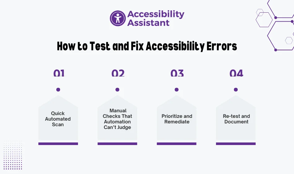
You don’t need a giant program to get started. Adopt a repeatable rhythm that pairs automation with human checks:
Step 1: Quick Automated Scan
- Use tools like WAVE, axe DevTools, Lighthouse, or a platform-specific scanner to catch low-hanging fruit (contrast, missing alt, headings, roles).
- If you’re on Shopify, WordPress, or Wix, you can also add an on-site widget like Accessibility Assistant to give users control over contrast, text size, spacing, and reading aids while you work through fixes.
Step 2: Manual Checks That Automation Can’t Judge
- Keyboard-only navigation from top to checkout.
- Screen reader pass on key journeys (JAWS/NVDA on Windows, VoiceOver on macOS/iOS).
- Zoom to 200% to ensure layouts don’t break.
Step 3: Prioritize and Remediate
- Tackle forms, navigation, and contrast first (they drive the most friction).
- Fix templates and components so improvements scale across pages.
Step 4: Re-test and Document
- Re-run your checks.
- Keep a lightweight log of issues, fixes, and dates.
- Add an Accessibility Statement that explains your commitment and how users can report barriers.
Key Accessibility Errors, Tools, and Practical Fixes
| Error | Tool to Detect | Fix in Practice |
| Missing/poor alt text | WAVE, axe, CMS media audit | Add concise, contextual alt; alt=”” if decorative |
| Low color contrast | W3C Contrast Checker, axe | Adjust palette to meet 4.5:1 (3:1 large text) |
| Unlabeled form fields | WAVE, axe | Use <label for=”…”>, ARIA where appropriate |
| Keyboard traps/no focus | Manual keyboard test | Visible focus, trap focus in modals, correct tabindex |
| Vague link text | Manual scan, screen reader pass | Replace “Read more” with specific, contextual labels |
| Multimedia without captions | Content audit | Add captions/transcripts; consider audio description |
| Motion/autoplay issues | Manual review, prefers-reduced-motion | Provide pause/stop, respect motion preferences |
Benefits of Fixing Accessibility Errors
- Better UX for everyone: Clear headings, legible text, and thoughtful forms help all users, not just those with disabilities.
- Stronger SEO foundation: Semantic structure, alt text, and fast, readable pages support search visibility.
- Lower legal risk: By aligning to WCAG AA, you reduce exposure to compliance complaints.
- Brand trust: Inclusive design sends a clear message: everyone is welcome.
How an On-Site Accessibility App Helps (and Where It Fits)
Accessibility apps don’t replace WCAG work, but they do help users personalize the experience while you remediate templates and content. If you run Shopify, WordPress, or Wix, Accessibility Assistant adds user-controlled support immediately:
- Profiles: Low Vision, Dyslexia, and Seizure Safe Mode
- Reading aids: Text-to-speech, reading mask, highlight links/titles
- Visual adjustments: Bigger text, high contrast, invert/desaturate colors, larger cursor
- Structure aids: Keyboard navigation, focus/hover highlights, center/left/right alignment
- Content comfort: Stop animations, mute sounds, hide GIFs, read-mode
- Global support: Works with ARIA labels and screen readers; supports 100+ languages
- Brand fit: Customize the widget’s icon, layout, and colors to match your theme
These controls make web accessibility for visually impaired users more practical right now, while your team fixes root-cause issues in code and content.
- Learn more: Accessibility Assistant Features
- Pricing for Shopify/WordPress/Wix
- Platform pages: Shopify App, WordPress plugin, Wix app
Content and Design Patterns That Prevent Regressions
- Design tokens: Bake contrast-safe colors and spacing into tokens so new UI ships accessible by default.
- Component library: Ensure buttons, inputs, dialogs, and menus meet keyboard and screen reader requirements—then reuse everywhere.
- Authoring checklists: Give editors a short checklist for headings, alt text, link wording, and captions.
- Pre-launch gates: Add a quick keyboard and screen reader smoke test to your release checklist.
- Change log: Track fixes and known limitations; update your Accessibility Statement when meaningful changes ship.
FAQs
1) What are the most common accessibility errors for visually impaired users?
Low contrast text, missing or inaccurate alt text, unlabeled form fields, vague link text, keyboard traps, and multimedia without captions or transcripts.
2) How do I test web accessibility for visually impaired users?
Pair automated scans (WAVE, axe, Lighthouse) with manual checks: keyboard-only navigation and a quick screen reader pass (NVDA/VoiceOver) on key journeys.
3) Why is color contrast such a big deal?
Without sufficient contrast, text and controls become hard to read—especially for users with low vision or color-vision deficiencies. Meeting contrast ratios is a core WCAG requirement.
4) Do accessibility widgets replace WCAG fixes?
No. Widgets help users personalize their experience, but you still need to fix templates, components, and content to meet WCAG AA. Use both.
5) How often should I audit my site?
Run checks quarterly and after major updates. Add a quick pre-release check for new templates and high-traffic pages.
Conclusion
Improving web accessibility for visually impaired users isn’t just a checklist; it’s a habit. Start with the highest-impact fixes: alt text, contrast, forms, headings, and keyboard access. Add captions and transcripts. Test with real assistive tech. Then keep the loop going with small pre-release checks and a short authoring guide.