
Legal blindness does not mean complete darkness. Most people who are legally blind have some usable vision. They may see shapes, light, movement, blurred text, or only a narrow field of view. When that experience shifts from the physical world to a digital screen, the challenges become very specific.
Websites are built with text, colors, icons, layouts, and interactive elements. For someone with legal blindness or severe low vision, those elements can become difficult, or sometimes impossible, to interpret. Understanding what legally blind vision looks like on websites helps designers, developers, and business owners create digital experiences that are usable, compliant, and inclusive.
This guide explains how legally blind users may experience websites, which design patterns create barriers, and how WCAG-based accessibility practices reduce those barriers.
What “Legally Blind” Actually Means
Before looking at websites, it’s important to clarify what legal blindness means in measurable terms.
In many countries, including the United States, a person is considered legally blind when:
- Their best-corrected visual acuity is 20/200 or worse in the better eye, or
- Their visual field is restricted to 20 degrees or less.
Visual acuity refers to clarity. Visual field refers to how wide someone can see without moving their eyes.
Legal Blindness vs Total Blindness
Total blindness is rare. Most legally blind individuals retain partial vision. They may:
- Detect light and shadow
- Recognize large objects
- See movement
- Read large, high-contrast text
That remaining vision influences how they use digital content. Many rely on magnification, high contrast settings, or a combination of screen readers and visual cues.
Low Vision vs Legal Blindness
Low vision is a broader category. It includes people whose vision is significantly impaired but does not meet the legal blindness threshold. Both groups face similar digital barriers, especially when websites use small text, low contrast, or cluttered layouts.
Understanding these distinctions is important because web accessibility must support a spectrum of visual experiences, not a single condition.
If you would like a deeper understanding of how legal blindness is defined and how prescription strength connects to accessibility considerations, read our detailed guide on what a legally blind prescription is and its accessibility impact. It explains the medical definition, vision thresholds, and how these factors influence digital usability standards.
How Legally Blind Vision May Appear on a Website
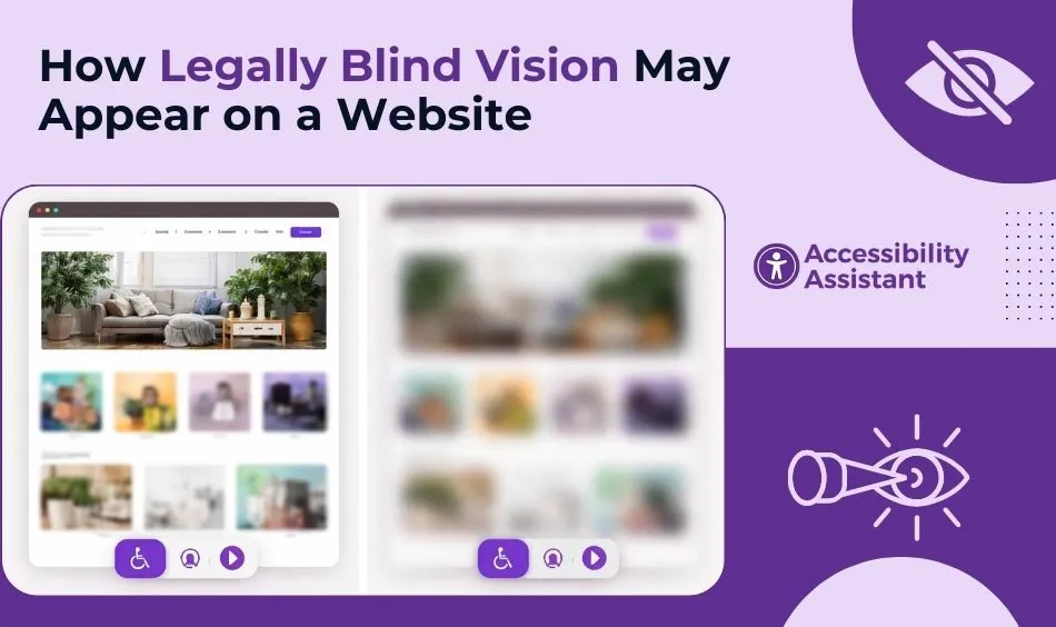
A website that looks clean and modern to one user may look blurred, incomplete, or overwhelming to another. Below are common ways legally blind users may experience web interfaces.
Blurry or Unreadable Text
Text may appear:
- Fuzzy
- Faded into the background
- Distorted
- Too small to interpret
Light gray text on a white background, thin fonts, or decorative typography often becomes unreadable.
Reduced Field of Vision (Tunnel Vision)
Some legally blind users have a limited field of view. This can create a tunnel-like experience where only a small central area is visible at one time. On a website, this means:
- Navigation menus on the side may be missed
- Call-to-action buttons may sit outside the visible area
- Layout scanning becomes slow and exhausting
Scrolling and scanning become more effortful because the peripheral context is missing.
Sensitivity to Brightness and Glare
Bright white backgrounds and high-glare designs can cause discomfort. Some users:
- Switch to dark mode
- Increase contrast
- Lower screen brightness
If a website does not adapt well to these adjustments, usability declines.
Difficulty Distinguishing Colors
Color perception may be reduced or altered. When websites rely on color alone to communicate information, such as red for errors or green for success, important meaning may be lost.
Low contrast between foreground and background is one of the most common accessibility failures across industries.
Loss of Detail in Icons and Graphics
Small icons, subtle outlines, or decorative elements can disappear entirely when magnified. Icon-only buttons without text labels become confusing.
How Website Design Can Create Barriers for Legally Blind Users
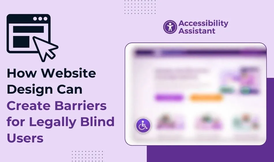
Certain design patterns frequently create access problems.
Low Colour Contrast
Contrast determines how easily text stands out from its background. WCAG 2.2 requires:
- A minimum contrast ratio of 4.5:1 for normal text
- 3:1 for large text
- 3:1 for UI components and graphical objects
Brand-driven color palettes often fail these thresholds.
Fixed Text Sizes
If text cannot scale to 200% without breaking the layout, users who rely on zoom may encounter:
- Overlapping elements
- Cut-off content
- Horizontal scrolling
WCAG requires content to reflow properly at increased zoom levels.
Small Interactive Elements
Buttons, links, and form fields that are too small or tightly spaced can be difficult to target—especially when magnified.
Complex Layouts
Cluttered designs with multiple columns, sidebars, pop-ups, and floating elements increase cognitive load and reduce clarity.
Accessible vs Inaccessible Website Experience
Below is a simplified comparison showing how design choices affect usability.
| Feature | Inaccessible Design | Accessible Design |
| Text Size | Small, fixed font | Resizable up to 200% without breaking layout |
| Contrast | Light gray text on white | Meets WCAG contrast ratios |
| Navigation | Hover-only dropdown menus | Keyboard-accessible and clearly structured |
| Buttons | Icon-only without labels | Text labels with visible focus states |
| Layout | Dense and cluttered | Clear spacing and readable hierarchy |
| Forms | Placeholder text only | Proper labels and error messages |
Accessible design does not mean unattractive design. It means a readable, structured, and adaptable design.
How Legally Blind Users Navigate Websites
Many legally blind individuals combine multiple tools and strategies.
Screen Magnification
Users may zoom content to 200% or more. This changes how layouts behave. Websites must remain usable under magnification.
Screen Readers with Residual Vision
Some users rely partially on screen readers to interpret structure while visually tracking highlighted sections.
High Contrast Mode
Operating systems provide high contrast settings that override color schemes. Websites that rely heavily on background images or fixed color styling may break under these conditions.
Keyboard Navigation
When precise mouse targeting is difficult, keyboard navigation becomes essential. Focus indicators must be clearly visible.
WCAG Requirements That Protect Legally Blind Users
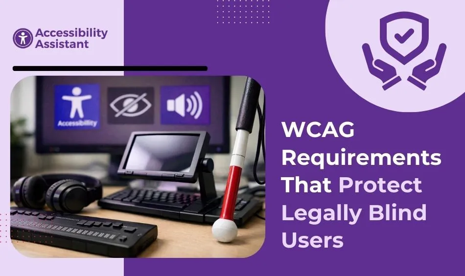
The Web Content Accessibility Guidelines (WCAG) provide measurable standards.
1.4.3 Contrast (Minimum)
Ensures sufficient contrast between text and background.
1.4.4 Resize Text
Requires text to be resizable up to 200% without assistive technology.
1.4.10 Reflow
Content must reflow at increased zoom levels without loss of information.
1.4.11 Non-Text Contrast
UI components must have adequate contrast against adjacent colors.
2.4.7 Focus Visible
Interactive elements must show clear visual focus indicators.
These criteria directly protect users with legal blindness and low vision.
Common Misconceptions About Legally Blind Vision Online
“Legally Blind Means Completely Blind”
Most legally blind users have partial vision and benefit from visual enhancements.
“Screen Readers Solve Everything”
Screen readers help, but they do not replace readable visual content.
“Zooming Fixes All Problems”
Zoom can introduce layout issues if the site is not built for responsive scaling.
“High Contrast Mode Is Enough”
High contrast settings help, but content must be structurally accessible to remain usable.
How to Test Your Website for Low Vision Barriers
You can identify many issues quickly.
Zoom to 200%
Check whether layout breaks or content disappears.
Test Contrast
Use a color contrast checker to confirm compliance.
Navigate With Keyboard Only
Press Tab repeatedly until visible focus indicators appear.
Enable High Contrast Mode
Observe whether the content remains readable.
Simplify the Screen
Hide decorative elements and confirm core content remains understandable.
These steps reveal common barriers.
Designing for Legally Blind Users Improves UX for Everyone
Accessibility benefits extend beyond compliance.
- Older adults experience age-related vision decline.
- Mobile users read content in bright sunlight.
- Temporary injuries can limit visual precision.
- A clear hierarchy improves scanning for all users.
Readable text, strong contrast, and logical structure enhance overall usability.
The Business and Legal Impact
Understanding legally blind vision is not only a design matter—it is also a compliance and risk consideration.
Regulatory frameworks reference WCAG standards when evaluating accessibility. Organizations that ignore accessibility may face:
- Legal complaints
- Reputation damage
- Loss of audience reach
Inclusive design supports ethical responsibility and business resilience.
Frequently Asked Questions
1. How can I tell if I’m legally blind?
Legal blindness is determined through a professional eye examination. In general, a person is considered legally blind if their best-corrected vision is 20/200 or worse in their better eye, or if their visual field is restricted to 20 degrees or less. If you are concerned about your vision, an optometrist or ophthalmologist can perform the appropriate tests to determine your visual acuity and field of vision.
2. What sight is considered legally blind?
Legal blindness typically refers to a visual acuity of 20/200 or worse in the better eye with corrective lenses. It can also apply when a person’s side vision (visual field) is severely limited. This definition is used for legal and accessibility purposes and does not always mean total blindness.
3. How do blind people see websites?
Blind and legally blind users access websites in different ways depending on their level of vision. Some rely entirely on screen readers, which convert text into speech. Others use screen magnifiers, high-contrast settings, or zoom tools to enlarge content. Many legally blind individuals combine visual enhancements with assistive technology to navigate digital content effectively.
4. Is minus 7 legally blind?
A −7.00 prescription indicates strong nearsightedness, but it does not automatically mean a person is legally blind. Legal blindness depends on how well a person can see with correction, not on the prescription number alone. Many individuals with a −7.00 prescription achieve functional vision with glasses or contact lenses.
5. Can you be legally blind but still see?
Yes. Most legally blind individuals still have some usable vision. They may see light, shapes, movement, or large text. Legal blindness does not mean complete darkness; it refers to a specific threshold of visual acuity or field limitation defined by law.
6. Is 20/100 legally blind?
No. A visual acuity of 20/100 is considered a significant vision impairment, but it does not meet the legal blindness threshold of 20/200. However, it may still qualify as low vision and could require visual aids or accessibility adjustments.
7. How much vision does it take to be legally blind?
Legal blindness is generally defined as having 20/200 vision or worse in the better eye with correction, or a visual field of 20 degrees or less. This standard is used in accessibility, disability benefits, and legal contexts.
Conclusion
Legally blind vision does not mean the absence of sight. It often means reduced clarity, limited field of view, and increased reliance on magnification and structured navigation. On websites, small design decisions, contrast ratios, font sizes, spacing, and layout behavior determine whether a page is usable or frustrating.
Designing for legally blind users requires thoughtful application of WCAG standards, responsive layouts, and consistent structure. These practices not only support accessibility compliance but also improve usability for everyone.
A website that remains readable, navigable, and adaptable under magnification is a website built for real people.
Understanding what legally blind vision looks like on websites is the first step toward building digital experiences that include rather than exclude.