

Color Contrast Checker
Check text and background colors for WCAG AA and AAA contrast standards. Enter your colors to test readability, accessibility, and compliance in real time.

| Element | AA | AAA |
|---|---|---|
| Aa Normal Text | ||
| Aa Large Text | ||
| Aa Non-Text |
Website
Accessibility Checker
Find out if your site is accessible for people with disabilities and meets the ADA, WCAG, and other requirements.
Enter URL to find accessibility issues on your site
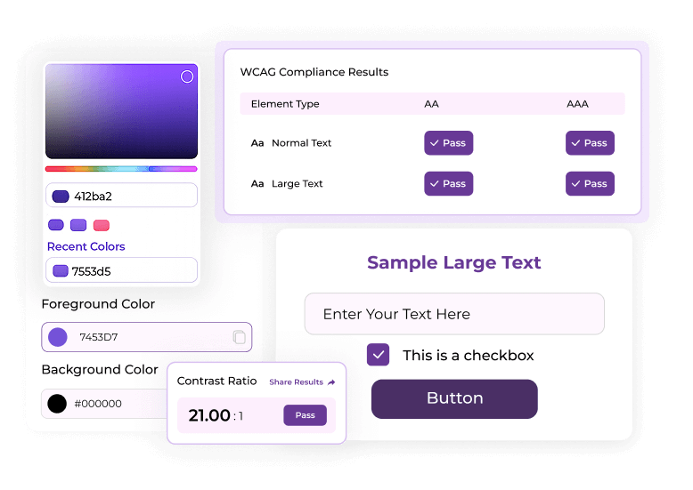
What This Color Contrast Checker Does
This tool measures the contrast ratio between two colors and checks if it meets WCAG AA or AAA standards. It displays clear pass or fail results for normal text, large text, and UI elements. You can enter color values manually or choose them using the built-in color picker for faster testing. The preview updates instantly, helping you adjust colors without switching between tools. It is made for design, development, and accessibility reviews.
With this tool, you can:
- Test text and background colors in real time
- View contrast ratios based on WCAG formulas
- Check AA and AAA accessibility levels
- Preview color combinations before using them
- Try improved color suggestions when your pair fails
Why Color Contrast Matters
Strong contrast helps users read content clearly without visual effort. It supports people with low vision, color blindness, or visual sensitivity.
Low contrast creates real barriers for many users, especially on mobile devices or in bright environments where text becomes hard to see.
A contrast checker for accessibility helps teams pick colors that remain readable across all screens and lighting conditions. Good contrast also strengthens brand presentation and improves the overall user experience.
With this tool, you can:
- Clear reading and reduced eye strain
- Better visibility for users with visual impairments
- Stronger UI elements and action states
- Higher accessibility scores for audits
- Improved trust through cleaner design
How to Use the Color Contrast Checker
Meet WCAG text readability in a few simple steps.

01 Enter Your Foreground and Background Colors
You can type HEX codes or use the color pickers.
02 View the Contrast Ratio
The tool calculates the exact ratio based on WCAG formulas.
03 Check AA and AAA Results
You will see pass or fail tags for normal text, large text, and UI elements.
04 Try Suggested Accessible Colors
Use improved shades if your color pair fails. The tool suggests alternatives that keep your design style while meeting
WCAG rules.
This makes the tool a reliable web contrast checker for digital teams.
Loading posts…
No posts found matching your criteria.
Got Question?
Straightforward answers to your biggest concerns.
What is a Color Contrast Checker?
A Color Contrast Checker measures the difference between text and background colors to confirm WCAG accessibility compliance.
How does a color contrast ratio work?
A Color Contrast Checker measures the difference between text and background colors to confirm WCAG accessibility compliance.
Why is color contrast important for accessibility?
A Color Contrast Checker measures the difference between text and background colors to confirm WCAG accessibility compliance.
Does this tool use WCAG contrast formulas?
A Color Contrast Checker measures the difference between text and background colors to confirm WCAG accessibility compliance.
What contrast ratio do I need to pass WCAG?
A Color Contrast Checker measures the difference between text and background colors to confirm WCAG accessibility compliance.
Can this accessibility contrast checker suggest better colors?
A Color Contrast Checker measures the difference between text and background colors to confirm WCAG accessibility compliance.
Which color formats does this tool support?
A Color Contrast Checker measures the difference between text and background colors to confirm WCAG accessibility compliance.
Can I use this tool for a full website review?
A Color Contrast Checker measures the difference between text and background colors to confirm WCAG accessibility compliance.